Photography has a lot of rules that are really just principles. Most of them are useful guidelines worth understanding, not edicts to be followed to the letter. In this photography fundamentals series, we’re going to look at when you should follow the rules—and when you should consider breaking them. First, though, we need to cover some of the most important fundamentals of photography composition.
Related: How to take good pictures in bright sunlight
The rule of thirds

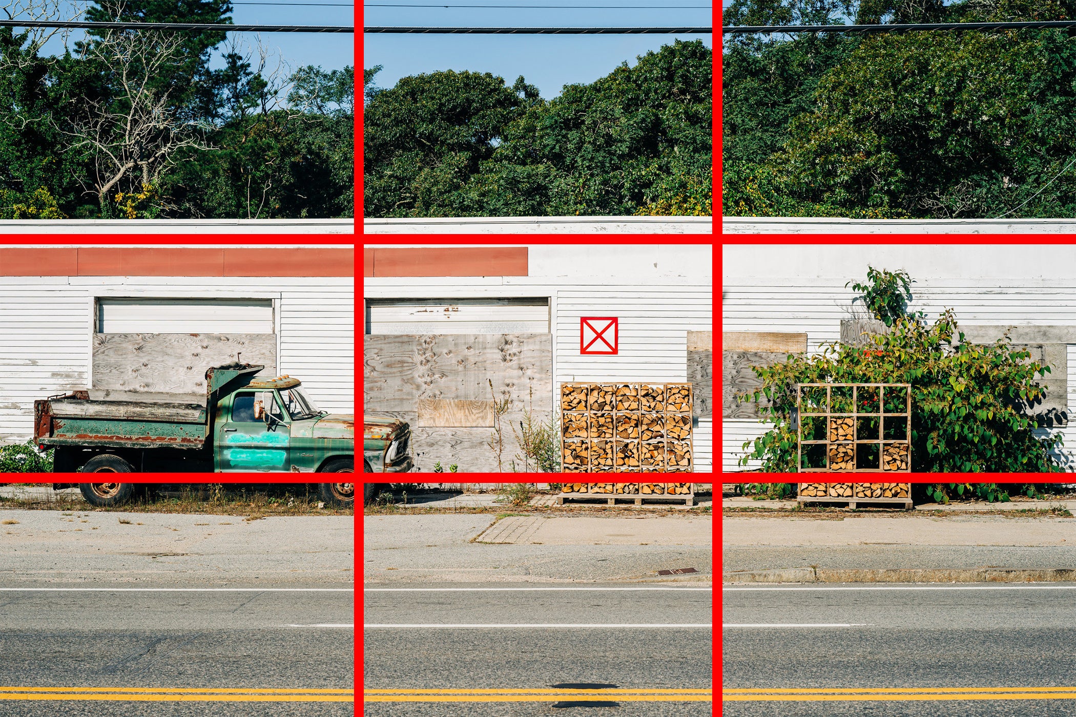
The rule of thirds is one of the most common—and most misunderstood—fundamentals of photography composition. The idea is that you divide your frame into thirds both vertically and horizontally. The important elements of your image should then be placed on one of these third lines or better yet, at one or more of the four intersections of both vertical and horizontal third lines, like the truck in the image above.
While not itself the secret to wonderful images, the rule of thirds is a great way to avoid some big compositional mistakes. If you follow it, you normally place the most important elements of your image nicely in the frame without them being too centered.
If you’ve got a reason to ignore the rule of thirds, go right ahead. Otherwise, it’s a handy starting compositional principle to work from.
The golden ratio

The golden ratio or golden spiral is similar to the rule of thirds, compositionally speaking, but with more mysticism and mathematics thrown in.
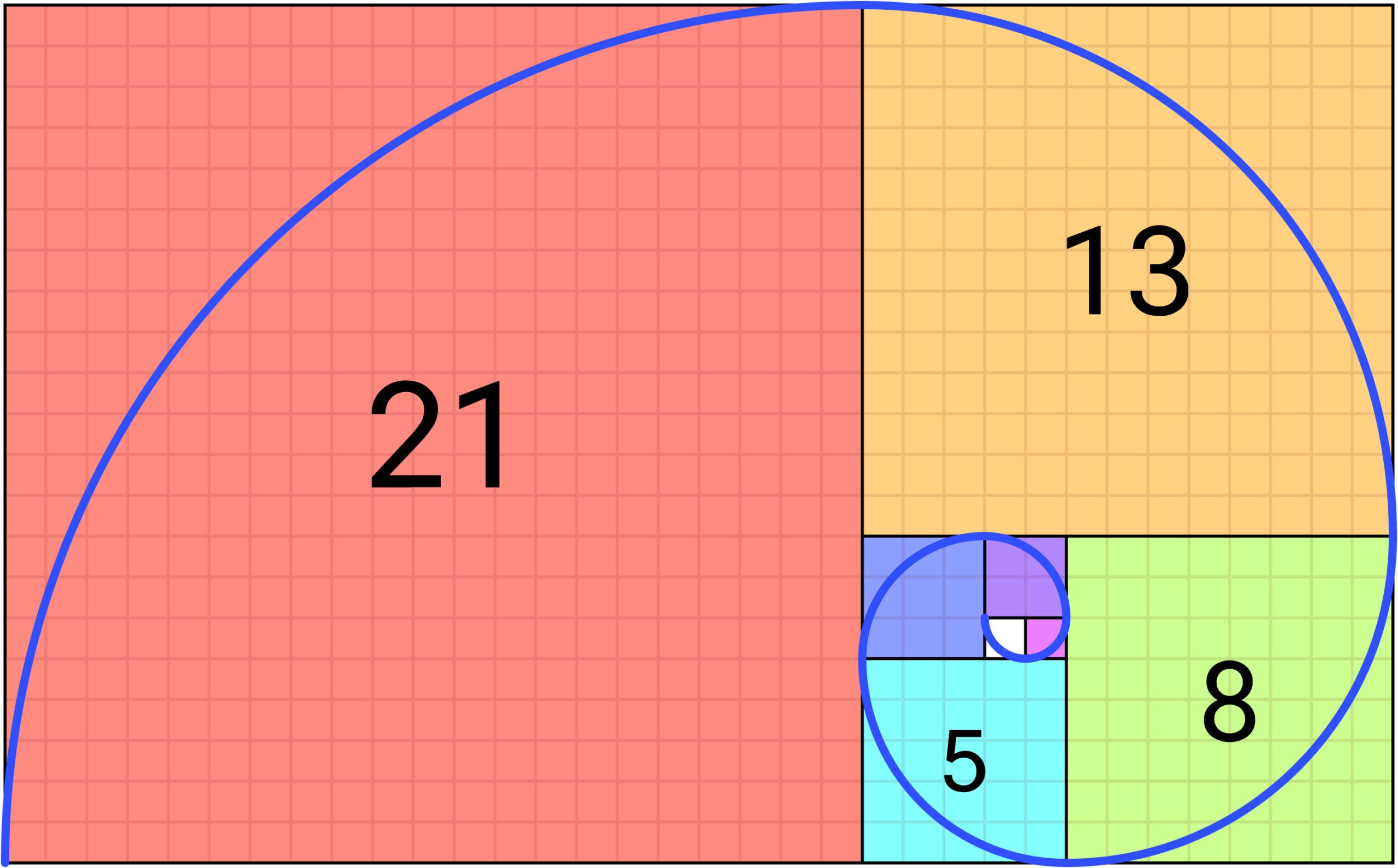
While the rule of thirds splits the frame into three equal sections, the golden ratio, also known as the Fibonacci Spiral, places a vertical frame line closer to the center of the frame, splitting it into one slightly smaller and one slightly larger quadrant. Each time the frame is split horizontally, the smaller section is then split vertically using the same ratio. This process is repeated, breaking the frame into smaller and smaller chunks, as shown above.

However, even though the ratio appears often in both great works of art and nature, we’ve yet to see an image where it creates a significantly stronger composition than the rule of thirds (they’re just so darn similar). So, while it can be fun to play around with, it’s certainly not a compositional rule that you should obsess over.
Symmetry
Symmetry can make for incredibly eye-catching images. It’s often easy to create symmetrical compositions with reflections, like from surface water, or using man-made structures, as shown below.

Symmetry is also one of the most fun compositional principles to break. Images with a mix of symmetrical and asymmetrical elements can be incredibly compelling.
Complementary colors
Think back to your earliest art class, remember the color wheel? Well, the same principles that apply to painting and drawing also apply to photography. Colors opposite each other on the wheel, when placed side-by-side or near one another, often appear brighter. So, photos with reds and greens, yellows and blues, or purples and oranges, for instance, will look extra vibrant and punchy. Use this knowledge to your advantage.
Leading lines

Our eyes are drawn to strong lines in images. This makes things like guide rails of a bridge or even just a road through a landscape, a great way to guide (or lead) your viewers’ gaze to the most important parts of your photo.
Leading lines isn’t so much a compositional rule you should break, as something you should be aware of if you don’t want to use it. If your image has strong lines, it will draw viewers’ attention. If you don’t want them looking where the lines lead, you will have to reframe your shot.
Fill the frame

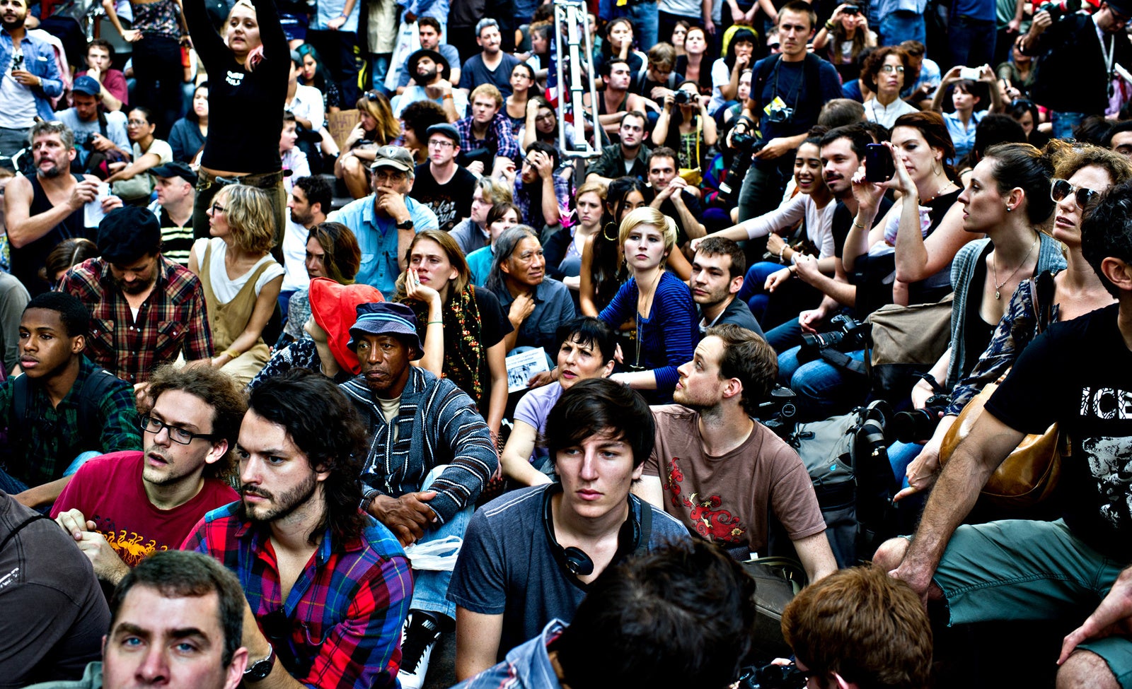
Filling the frame is a compositional approach that says your subject or subjects’ should take up as much of the image as possible. With a portrait, this generally means cropping in so that the subject’s face or body completely fills the frame. This removes the background and as a result, the context of the scene from the subject, often leading to some pretty dramatic results. The same approach to can be applied to a crowd, as shown above.
While a useful stylistic approach for many kinds of photography, there are plenty of times when you shouldn’t fill the frame with your subject. For example, if you are trying to show size by situating your subject in its environment, or trying to create a sense of isolation, filling the frame will undermine your intent.
Don’t cut things off

A common principle recommended in many photography books is to avoid cutting limbs, torsos, and other crucial parts of the image with the edge of your frame. It’s easy to understand why; most people look silly with half their hand chopped off. However, it can be tricky to pull off in practice, especially when you’re shooting street or travel scenes.
At a fixed point, the photograph ends but the world continues. While it is worth thinking about what is getting cut out of the image by the frame, you will always have to make a decision that cuts something out. (Just try to keep as many limbs in the image as possible.)
Keep the action going into the frame

Especially for sports and other kinds of action photography, a good principle is to keep the action going into the frame. This means that if your subject is running to the right, then they should be positioned to the left of the image so they are running into the open space.
This is another rule that works in a lot of situations, but can readily be broken when you have cause to do so. For example, if you are shooting a 100m sprint and want to show the gap between first and second-place runners.
Useful rules, but not laws
Photography is a wonderful mix of science and art. While the process of capturing an image relies on the laws of physics and mathematics, composing a photograph is a pure art. Although the fundamentals of photography composition include some fantastic rules, they are best viewed as starting points that will stop you from making mistakes, rather than laws that can’t be broken.
In the next article in the series, we’ll look at how to do just that.
The post Photography’s golden rules and when to break them appeared first on Popular Photography.