According to forecasters, digital advertising is growing faster than experts previously predicted. Agencies say that 2021 was a record year for ad spending, and some predict that social media advertising will soon surpass spending on TV ads. The world of advertising is growing, and it’s also changing, and brands will have to keep up in order to stay relevant.
In an increasingly saturated market, ads that resonate on a more personal level will continue to outshine those that feel generic and out-of-touch. For many brands, the right visuals serve as the backbone of a successful campaign. Uniting people over shared experiences, memories, frustrations, and goals, great images can transcend language or cultural barriers and cross geographical and political lines.
Here are just a few simple tips for Licensing Contributors on building an inclusive commercial photography portfolio that reaches today’s consumers.
Keep it real
In many ways, “authenticity” has become a buzzword in commercial photography, but it does speak to something important: people know when brands are being fake. That “fakeness” can show up in a few ways: maybe the brand is not sustainable but uses “greenwashing” to create the impression that they are, or perhaps they edit and retouch their models to look “flawless.” Either way, it’s alienating.
One survey suggests that 90% of millennials agree that authenticity is an important factor in determining what brands they want to support, with 30% having unfollowed a brand on social media because they found the content inauthentic. The lesson here is this: real-life, unstaged moments form the foundation of a strong Licensing portfolio.
Turn to the people in your life and community, and tell stories that are meaningful to them, whether it’s documenting a neighbor getting ready for work or capturing your kids enjoying summer camp. Even small, seemingly mundane “micro-moments” can help make a shoot feel more relatable. “Within a larger shoot, consider including some shots that feature your models looking away or slightly off camera,” the 500px team suggests. “This helps the audience place themselves within the scene.”
Finally, celebrate what makes your models unique, and champion diversity by including people of all genders, body types, abilities, and experiences. Take a collaborative approach, and listen to their voices and ideas. The more comfortable they are with you, the more authentic the photos will be.
Celebrate our furry friends
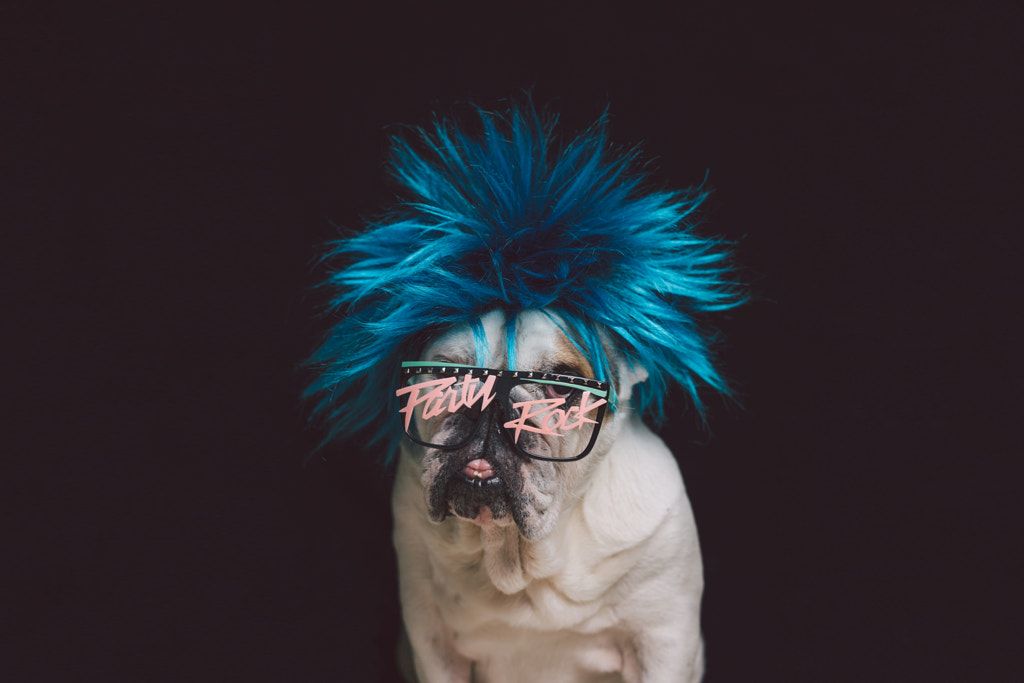
Our pets are family, and brands are tapping into that bond. In 2020, during lockdowns associated with the pandemic, as many of us found ourselves spending more time with our animals, pet brands spent 51% more on advertising when compared with the previous year. Meanwhile, within the 500px collection on Getty Images, some of the most popular photographs include David Bouchat‘s portrait of his bulldog enjoying a road trip and Andrés López‘s portrait of Sam the dog with his tongue out.
When working with animals, practice ethical photography. That means never “renting” out exotic animals or purchasing animals for a photoshoot. Instead, document the animals in your life expressing and enjoying their natural behaviors, whether it’s lounging in the sun at home or playing ball in the park. The session should be fun and enriching for them.
“Photograph pets being quirky while going about their daily lives, and consider funny or humorous encounters,” the 500px team suggests. “Maybe you celebrate an unlikely friendship; for example, between cats and dogs or a horse and a goat.”
Most importantly, embrace your pet’s unique personality; choose activities they love, and let them shine. You might remember that earlier this year, a video of a husky watching a commercial featuring another dog playing on a trampoline went viral online, drawing millions of views (update: the husky got her own trampoline).
Embrace humor
“Humor is hard to nail, but when done right, it can be a very useful tool in marketing campaigns,” the 500px team says. A look through the most popular photos within the 500px collection on Getty Images confirms this idea, with highlights ranging from Marcia Fernandes‘s portrait of a kid getting a big kiss from her dog to Philip Olsen’s snap of a cat mid-yawn.
According to research from Kantar, humorous ads are more distinct, engaging, and expressive than ads without humor. But their research also indicates that the use of humor in advertising has been on the decline in the last twenty years. While just 33% of ads the company researched incorporated humor, funny ads accounted for half of their Kantar Creative Effectiveness Award-winners. And although brands fear getting it “wrong,” people still crave humor in ads, and they still feel bonded to brands that use it right.
While we might associate humor mostly with video ads (think the Geiko gecko or Apple’s ‘The Whole Working From Home Thing’), it can be captured in still photography too. Look for those genuine, playful moments in your life, and keep an eye out for those candid expressions on set. “Humor is universal, and laughter creates connections,” the 500px team explains.
Use color to your advantage
The color wheel has been an invaluable resource for marketers for decades, and in many ways, it’s only become more powerful in our image-saturated, online world. Even sneaker companies have bet big on color theory—last year, Jenny Ross from New Balance told The New York Times that between 70% and 90% of our subconscious judgment was made within just a few seconds based on the color of a product. Heiko Desens from Puma, meanwhile, told them that they’d observed positive reactions to trendy colors like strong yellows.
Whether you’re experimenting with Pantone’s much-anticipated Color of the Year or tapping into various symbolic connotations associated with specific colors—for example, in Korea, pink represents trust, while in the United States, it might evoke feelings of optimism—it’s worth brushing up on your color theory and incorporating it into your shoots.
Even one strong color can form the foundation of your color palette; Cindy Crawford’s famous 1992 Pepsi ad was all about that bright red Lamborghini. Or pair two complementary colors; consider Apple’s iconic, Ridley Scott-directed 1984 Macintosh Computer commercial, featuring a dystopia awash in a sea of blue-gray tones—and one woman who dared to challenge the status quo, wearing a pair of bright orange shorts.
Get conceptual
“Conceptual still lifes are great for communicating clear ideas,” the 500px team shares. “Portraying universal themes in new and creative ways draws people in, inspiring us while also feeling accessible to a broad audience.” You don’t necessarily need a human element for these shoots, though you can always have a hand reaching into the frame.
Some of the greatest print ads in recent years have been conceptual still lifes; think, for example, about the Colgate dental floss ad, featuring a strawberry with all its seeds removed; Chupa Chups’s sugarfree lollipops ad, featuring ants avoiding the candy; or the Van Gogh Museum Cafe ad that used a mug with its handle broken off—a reference to the artist himself.
These kinds of images tend to work best when they’re simple and easy to understand, so make sure your concept and your execution are straightforward. It can help to have plenty of negative space around your subject, not only so clients can crop and personalize your image, but also so that your idea comes across clearly.
Not on 500px yet? Click here to learn about Licensing with 500px.
The post How to break down barriers within your Licensing content appeared first on 500px.


