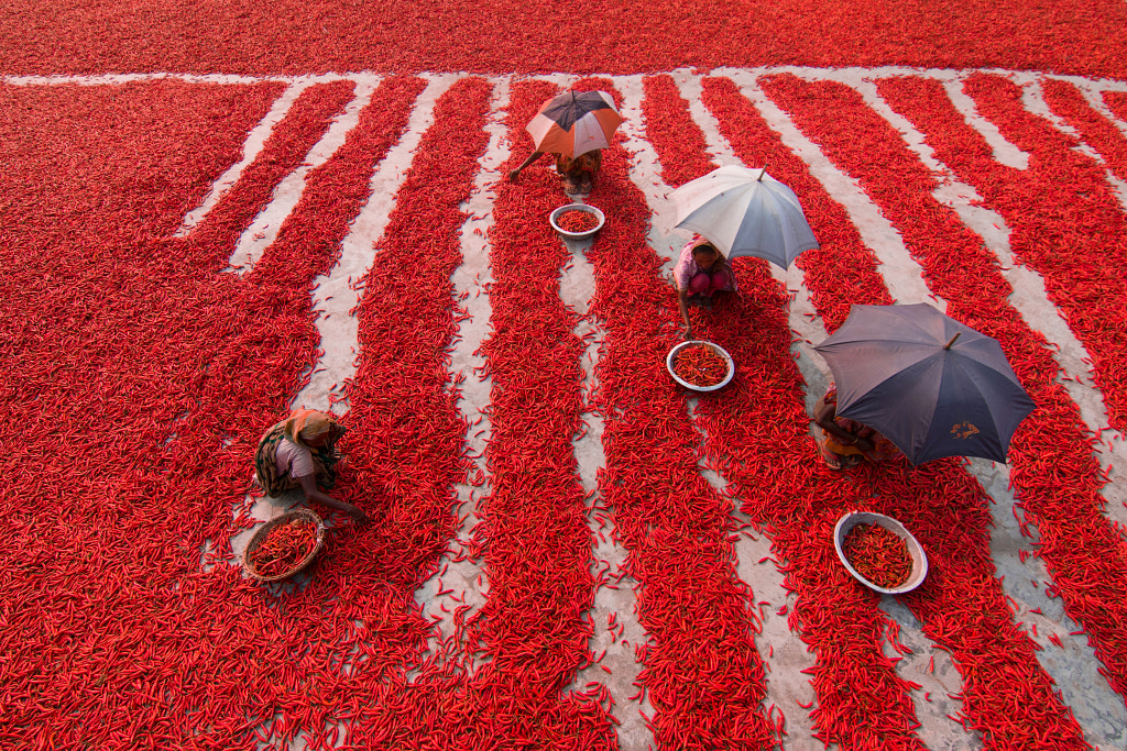
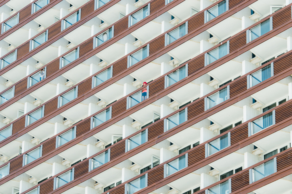
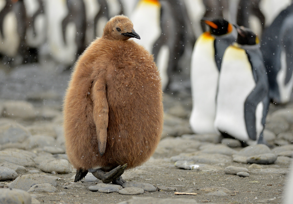
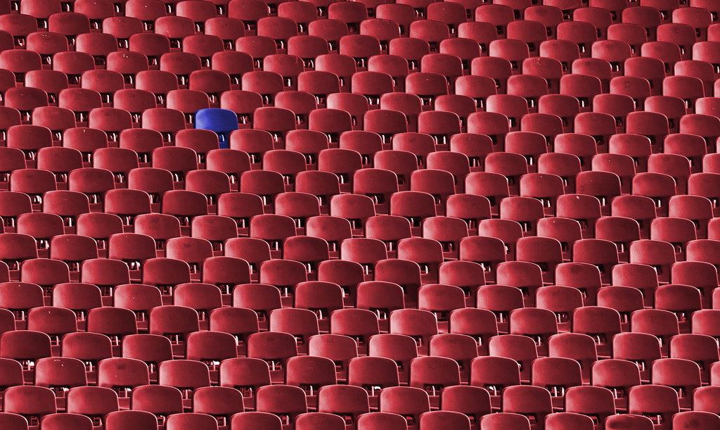
The word “juxtaposition” has long dominated exhibition catalogs and artist statements, used by everyone from architects to painters, but some of today’s biggest mainstream photography trends also revolve around the theme of juxtaposition.
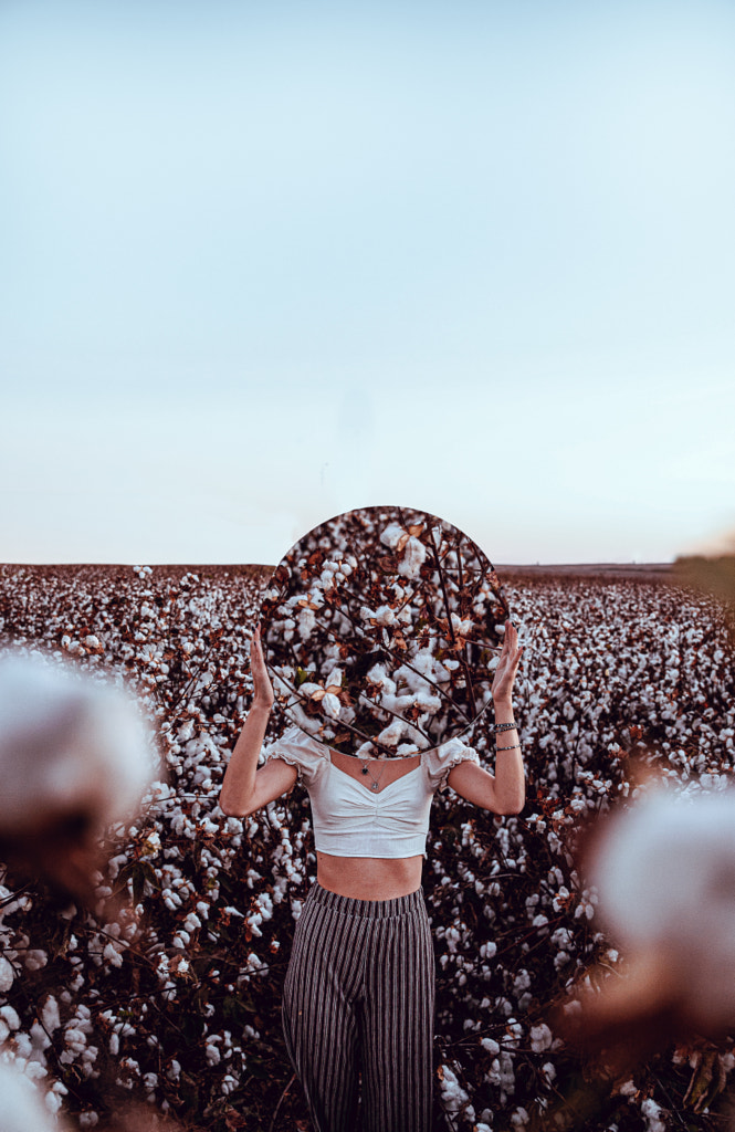
From forced perspectives of people “holding up” the sun or moon to landscape photos of “tiny people in big places” to double-take portraits made using mirrors, some of the most popular and familiar motifs on social media speak to the power of comparison and contrast in photography.
In art, as in literature, juxtaposition refers to the side-by-side placement of two or more contrasting things. As with color, shape, and cropping, juxtaposition can become a key component of photographic compositions, helping to tell a story and emphasize differences or similarities between objects or people.
At its simplest, juxtaposition is about using comparisons to spark emotions, resulting in that “aha!” moment that so many of us seek when looking at photographs. It boils down to the element of surprise—a secret “inside-joke” between the photographer and the viewer.
Beyond that, juxtaposition is a theme that spans genres, from street photography to landscapes. Below, we’ll take a look at some exciting and unexpected examples of juxtaposition within the 500px community.
Big versus small
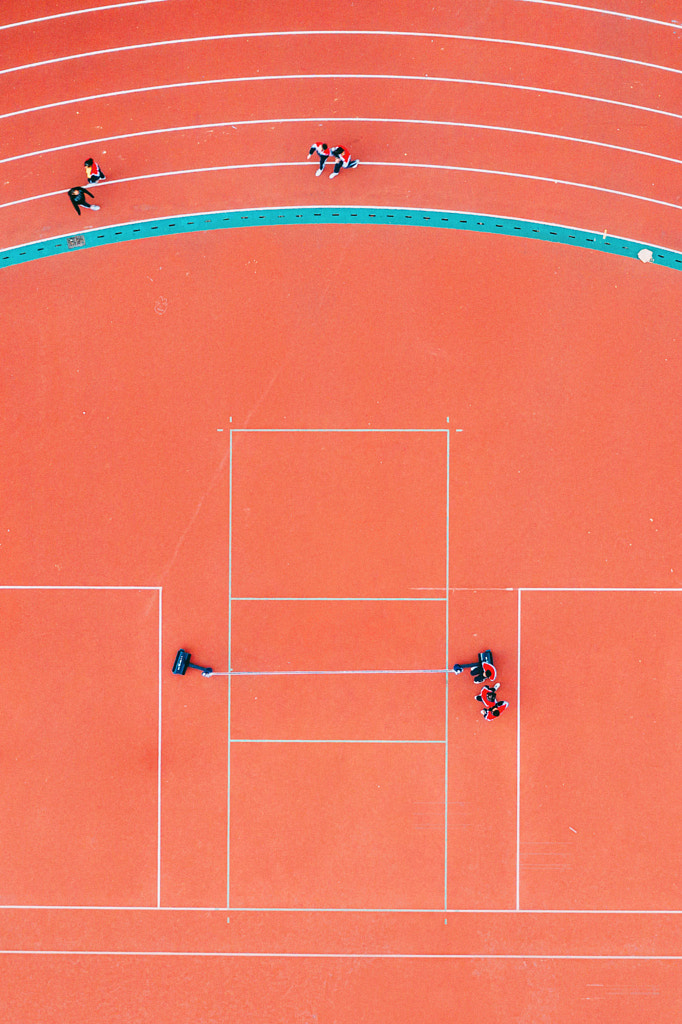
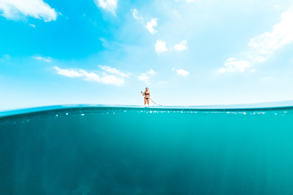
One of the most common uses of juxtaposition is to convey a sense of scale (e.g., #tinypeopleinbigplaces). The French street photographer Henri Cartier-Bresson did it all the way back in the 1930s; in the empty streets of Tuscany, the Royal Gardens of Paris, the stairways of Cyclades, Greece, human figures appear as small as ants, dwarfed by the cities and landscapes around them.
In more recent years, these big-versus-small juxtapositions have spoken to our collective concern for the natural world; by showing just how small we are in comparison to wild, untouched landscapes, photographers can appeal to our sense of reverence and our desire to preserve what’s left of the planet.
Near versus far
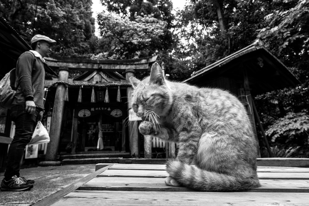
This one goes back to the forced perspective trend we touched on earlier; any photo that uses proximity to make a subject appear larger or smaller than it is, is an example of forced perspective. It works particularly well in street photography, where your position can make a person look tiny—and a dog or a cat appear huge in comparison.
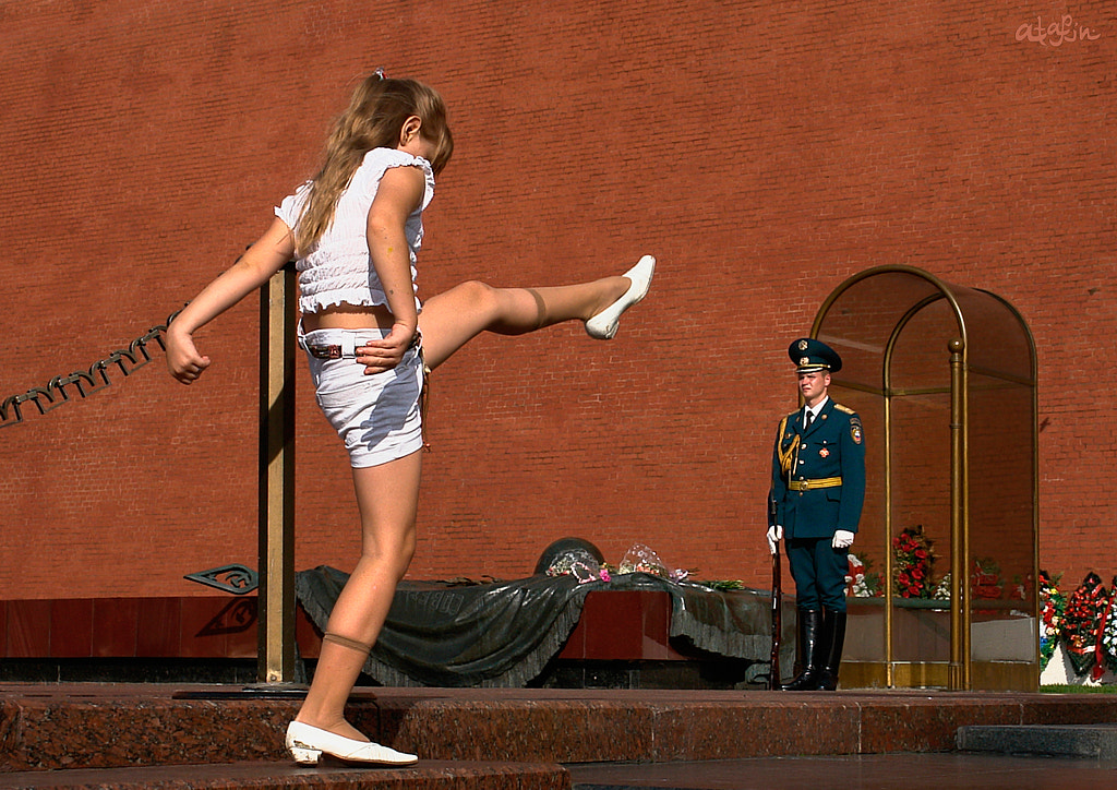
Similarly, a forced perspective can trick the eye into believing a child is larger than an adult. It’s a clever aesthetic technique, but it can also carry additional layers of meaning, signifying what element is most important and worthy of our attention.
Light versus dark
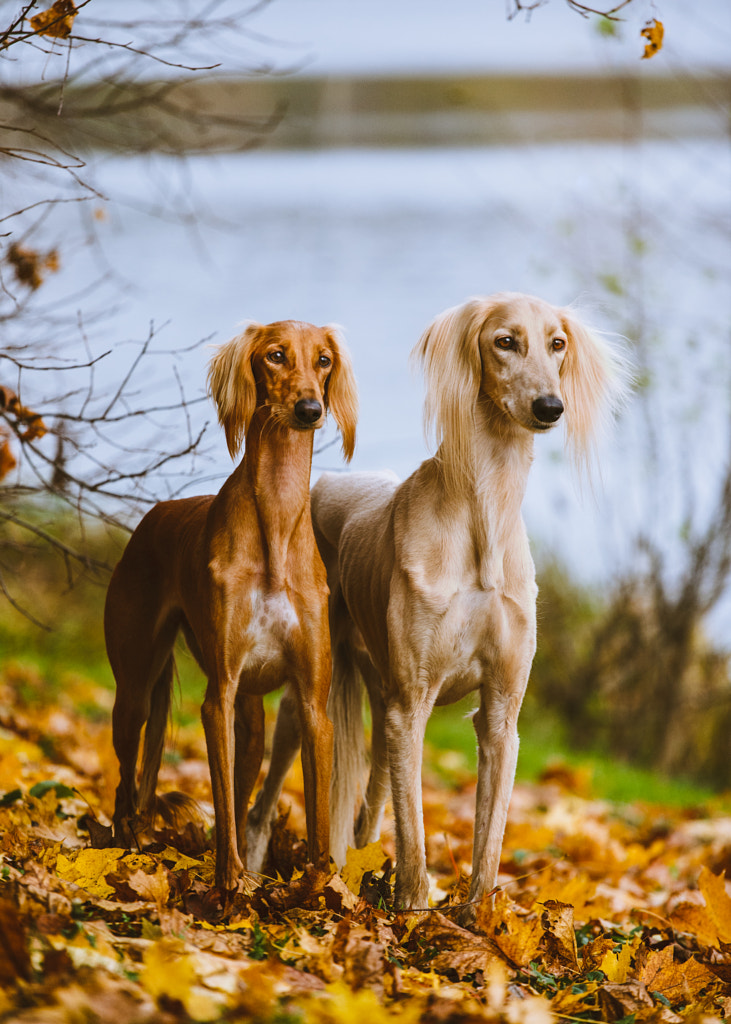
The renowned photographer Elliott Erwitt is a master when it comes to juxtaposition, and his book Dogs Dogs is a prime example. In its pages, you’ll find several pairs of dogs—waiting for a taxi in New York City, looking out a window in New Orleans, or hanging out by a bench in London.
Erwitt plays with scale a lot, but he also experiments with color. A few of the most powerful of his images feature a white dog sitting beside a black one—and that play on color is something photographers still use decades later.
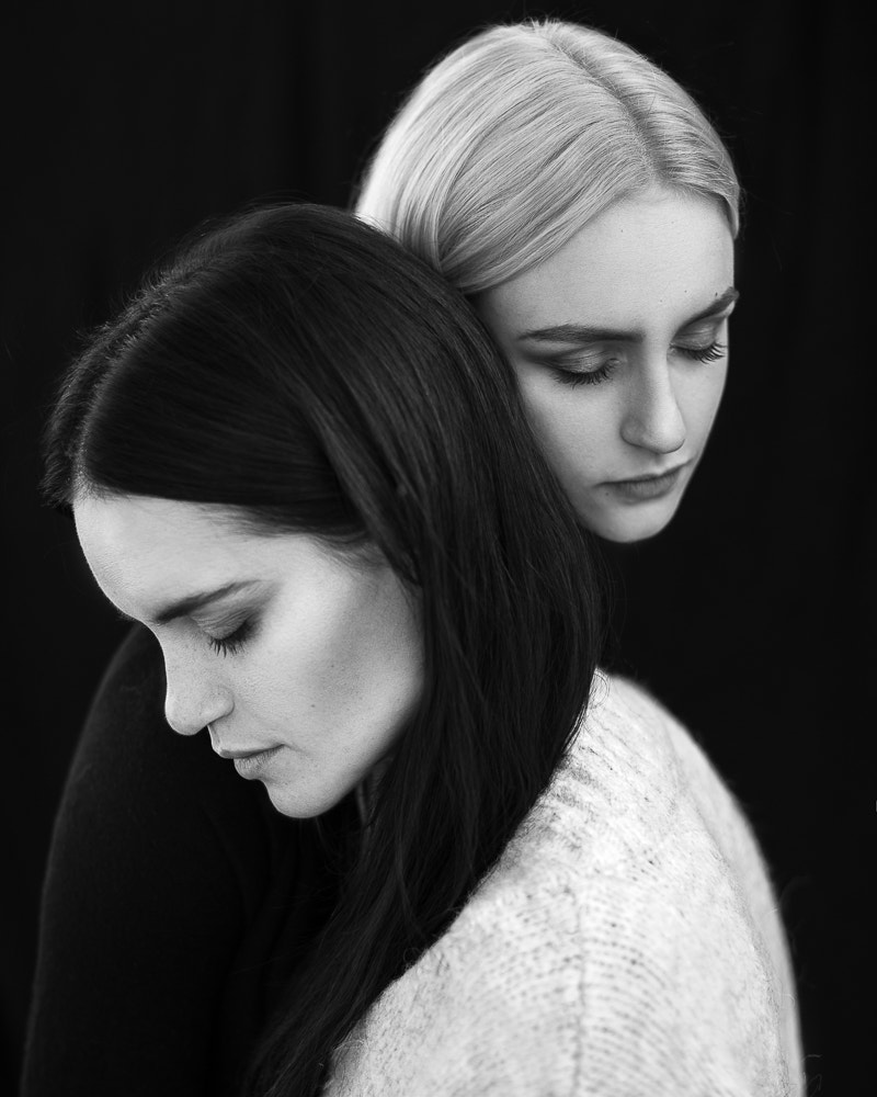
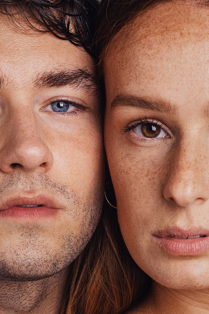
Of course, you can employ this technique when you’re working with humans too by juxtaposing light hair and dark, brown eyes and blue, etc. The possibilities abound with this one are endless.
Human versus object
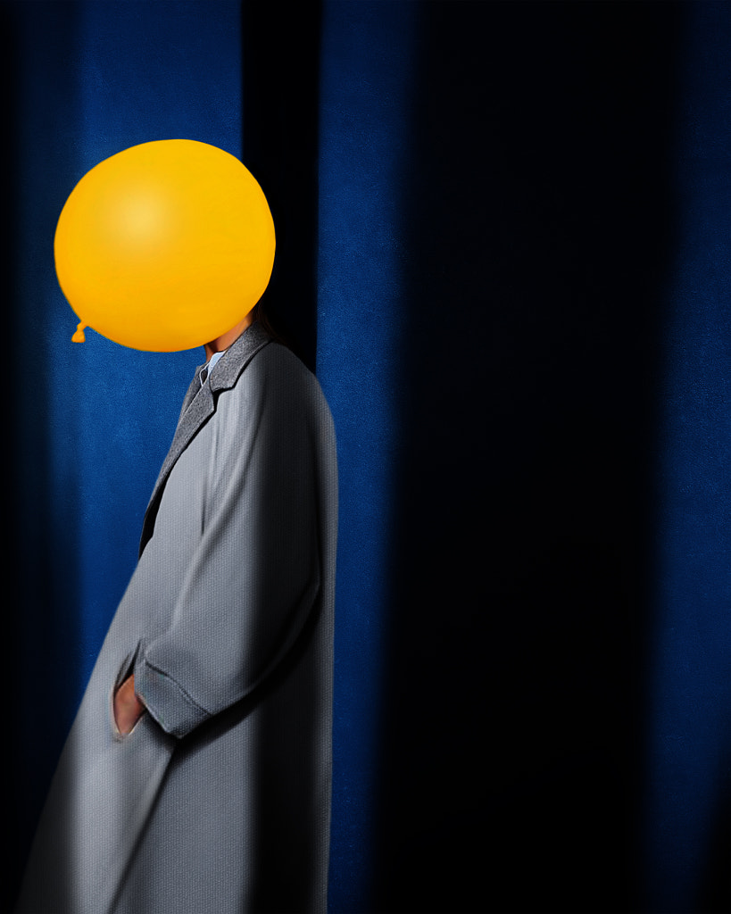
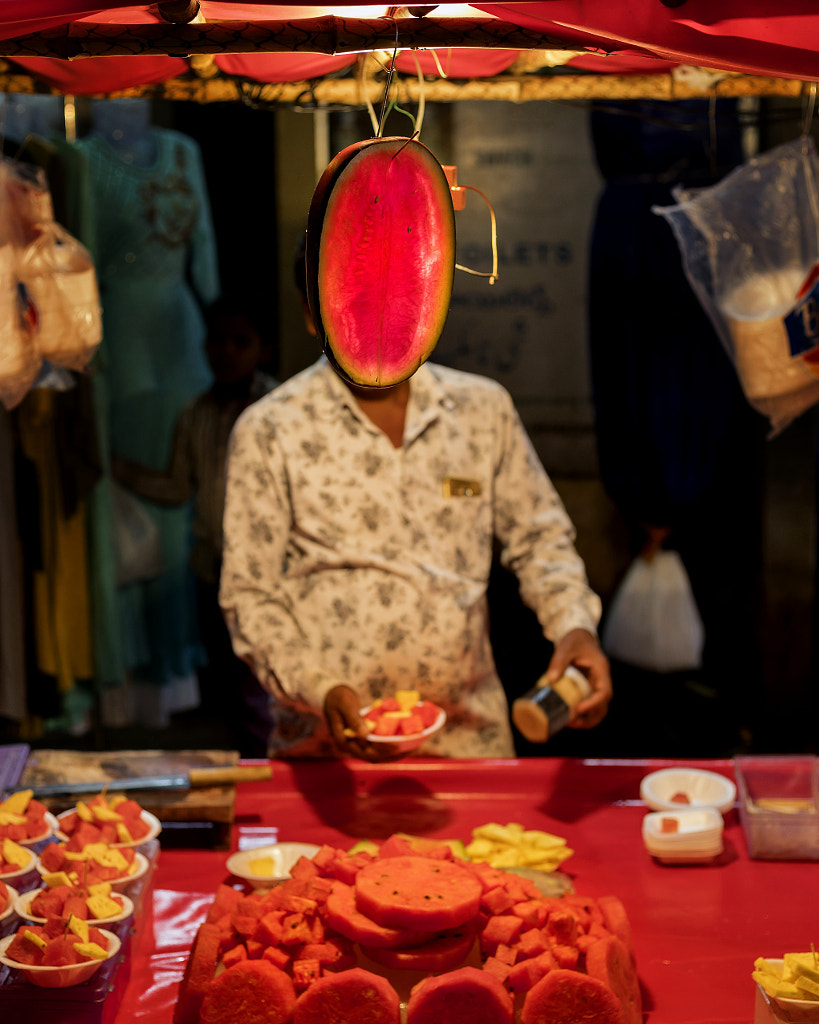
If you’ve read about juxtaposition in photography, chances are you’ve come across at least one reference to Robert Doisneau’s portrait of Picasso, in which the artist’s hands have been replaced by loaves of bread.
These comparisons between the human body and inanimate objects can be subtle and surreal, and they also pack a comedic punch. Watermelon Man (above) by Kishan Sri in India is a perfect—and serendipitous—example of this technique.
Right versus left
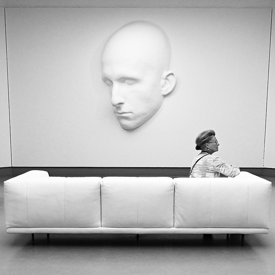
This photo (above) by Peter Nientied has multiple levels of juxtaposition, from the light-versus-dark theme to the human-versus-object motif, but one of the most powerful boils down to the direction of the subject’s gaze. While the artwork she’s viewing faces one direction, she leans the other way, making for a compelling composition.
Subject versus environment
Juxtapositions in photography can be planned, but just as often, they’re the product of coincidence. The American photographer Stephen Shore’s body of work, for example, is punctuated by miraculous everyday coincidences where everything comes together: a woman’s green pants match the color of her car, a couple’s outfits echo the pale blue of a nearby building, some bags of onions are almost the same shade of orange as the truck behind them.
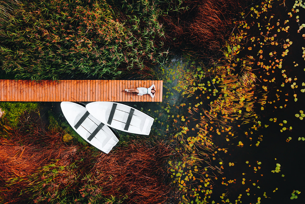
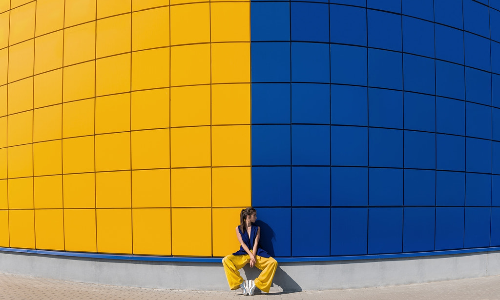
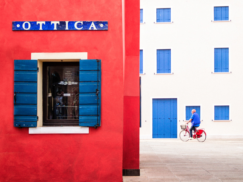
In short, look for parallels between your subject and the setting in general. These can be colors, patterns, shapes, or all of the above. You can capture them spontaneously and on-the-fly or organize a photoshoot around your idea.
Many versus few
The photographer Steve McCurry uses this one a lot in his compositions, showing groups of people with one person who’s slightly different from the rest. Maybe it’s one person in green Holi powder, surrounded by those in red, or perhaps it’s a single fisherman in the water, right next to a group of his peers on stilts.
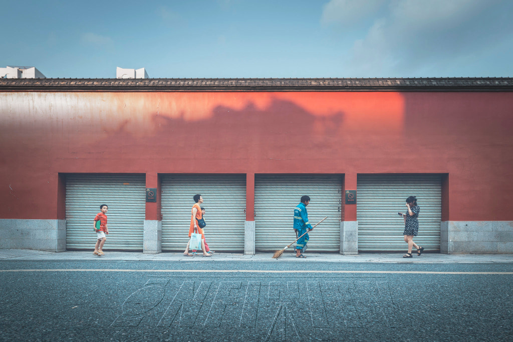
For photographers, the many-versus-the-few motif can take on different meanings, depending on the context. You can use it to explore themes like conformity and dissent, togetherness and isolation, individualism and community—or you can employ it just because it’s a beautiful visual effect.
Organic versus man-made
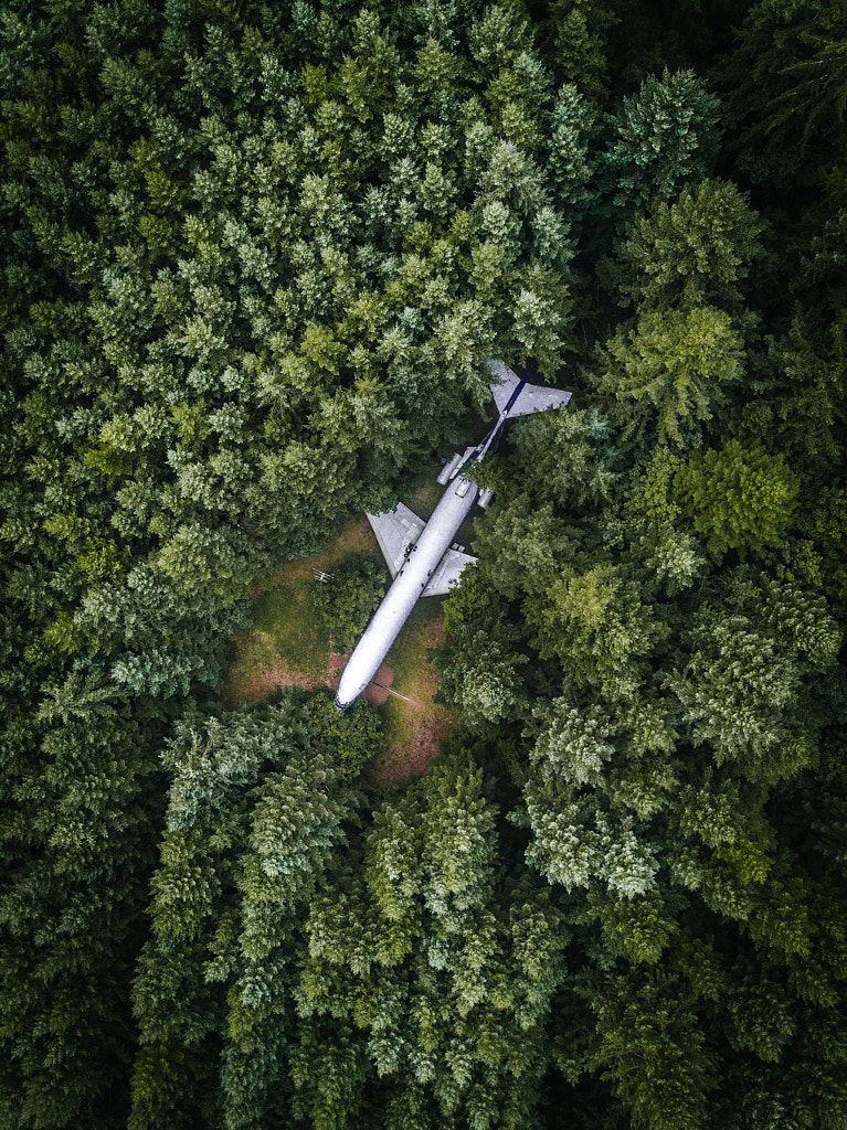
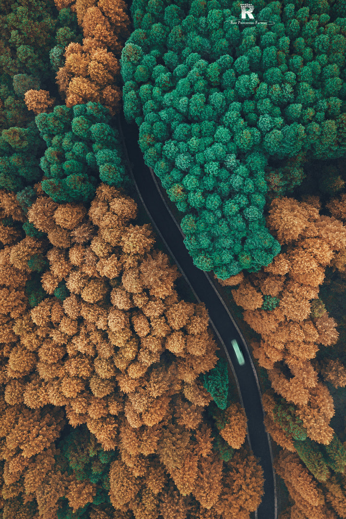
According to research, humankind has significantly altered three-quarters of our planet’s land and two-thirds of our oceans. As habitat destruction and deforestation threatens our natural resources, photos juxtaposing wild and organic elements with geometric, man-made ones take on new significance.
While early landscape photographers like Ansel Adams and Carlton Watkins captured the majesty of the natural world, today’s photographers are also drawing comparisons between the built environment and pristine wilderness.
Whether it’s through aerial images or urban exploration, they’re touching on the unexpected intersections between two seemingly disparate worlds—while also pointing to possibilities for the future of humankind (both utopian and dystopian).
Juxtaposition in facial expression
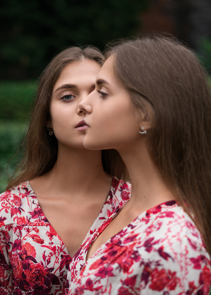
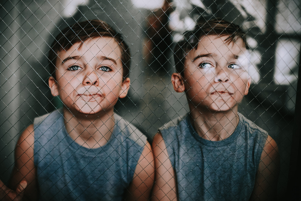
Juxtaposition in faces can be a powerful tool in portraiture. Diane Arbus taught us that when she photographed twins Cathleen and Colleen Wade in 1967; they might be identical, but when placed side-by-side, their differences are what stand out. Colleen is smiling. Cathleen is not.
In this image (above), titled Bored, the photographer Heather Wilson—who has twins of her own—does something similar. The boys are identical, and they’re wearing matching shirts, but somehow, it’s their dissimilarity rather than their likeness that catches our attention.
Reality versus photography
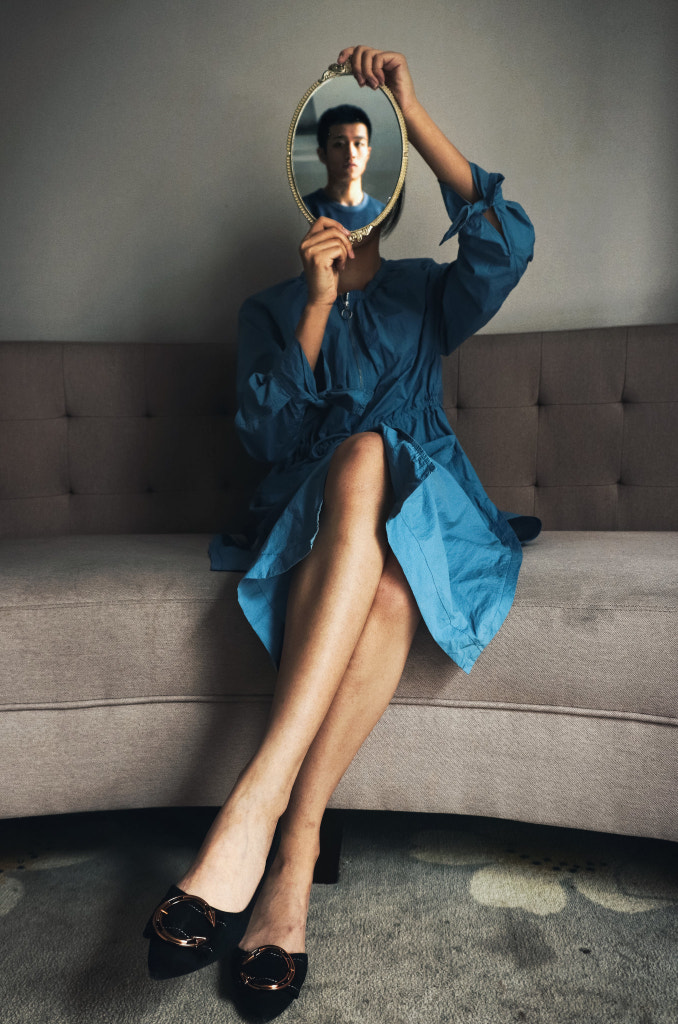
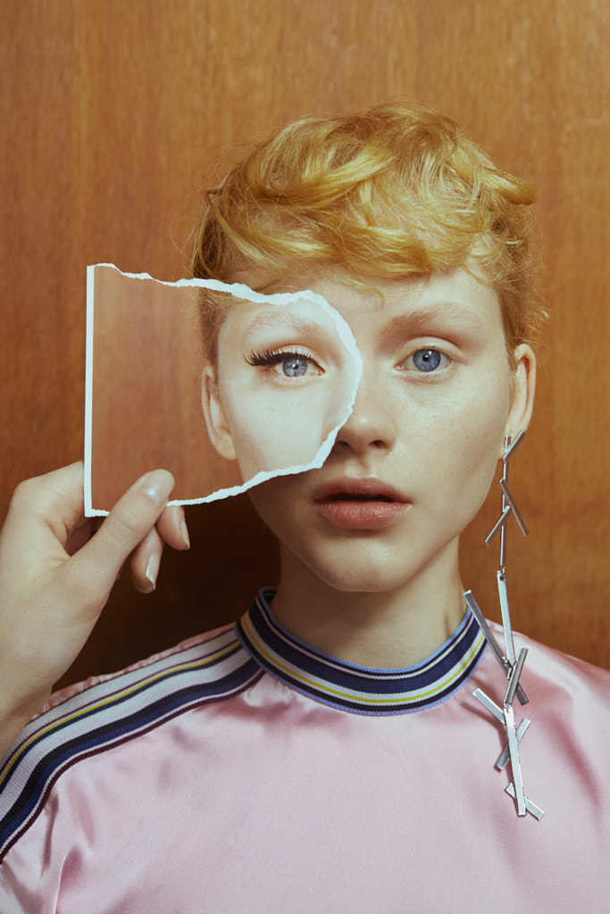
This one is more conceptual, but it’s also timeless. Before photography, painters used the “painting within a painting” motif to explore the thin and blurry line that separates art from life. A clear example is within the work of the surrealist René Magritte, where the boundary between the real and the make-believe tends to overlap.
Because photographs are inherently realistic, they can be employed in a similar way. This portrait by Marta Bevacqua juxtaposes a real face with a photograph of a face, but that’s where it gets tricky. Of course, none of it is “real” in the essential sense; the whole thing is a photograph and therefore, an elaborate illusion.
Past versus present
By 2050, a forecasted 66% of the world’s population will live in urban areas. Modern megacities can serve as a playground and muse for photographers—in part because they’re changing and expanding at such a rapid rate.
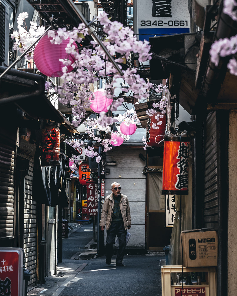
In some neighborhoods in cities like Tokyo, Shanghai, Delhi, or Lagos, you can wander for hours, exploring the contrast of old versus new, in the form of architecture, traditions, and activities. While one element might convey a particular aspect of a city’s culture, two juxtaposing details can tell the story of its past, present, and future.
As you might notice, even the most subtle juxtapositions often leave a lasting impact. Sometimes, it’s used as a visual joke or pun, and sometimes, it has a sobering effect, as in the case of photographs that reveal the disparities between extreme wealth and poverty.
Regardless of whether it elicits delight, shock, or reflection, juxtaposition encourages us to “look twice” even when we’re busy scrolling through the internet. In our increasingly fast-paced world, that seems more important than ever.
Not on 500px yet? Click here to learn about Licensing with 500px.
The post Juxtaposition in photography | 26 Examples to inspire your photography appeared first on 500px.
